Introduction
Embroidered typography, or the art of creating letterforms with thread, represents a fascinating intersection of design and craftsmanship. This technique transforms written language into a tactile, visual experience, where each stitch contributes to the overall aesthetic and impact of the text. Whether used in monograms, quotes, or decorative elements, embroidered lettering allows for a unique expression of personality and style, combining traditional sewing techniques with modern design principles.
In exploring this art form, understanding the intricacies of both embroidery and typography is crucial. Mastering various techniques, from selecting the right fonts and colors to overcoming common stitching challenges, enables the creation of visually stunning and legible text. By delving into the creative possibilities and technical skills involved, embroiderers can elevate their lettering projects, making them stand out with sophistication and flair. This comprehensive approach ensures that each piece not only conveys a message but also serves as a testament to the artistry of embroidered design.
1. The Foundations of Embroidered Lettering
The foundations of embroidered lettering encompass several critical elements that form the backbone of successful text based designs in embroidery. This section delves deeper into these foundational aspects, providing a comprehensive understanding of how each component influences the final outcome.
The Impact of Typography on Embroidery
The choice of font in embroidered lettering is paramount, as it directly affects the legibility, aesthetic appeal, and overall effectiveness of the design. Typography, when applied to embroidery, requires a nuanced approach compared to traditional print or digital formats.
• Understanding Font Characteristics: Not all fonts are created equal when it comes to embroidery. Serif fonts, which have small decorative lines or extensions at the end of each stroke, can pose challenges due to their intricate details. These finer elements may not translate well onto fabric, especially at smaller sizes, leading to a cluttered or illegible design. Sans serif fonts, on the other hand, with their clean and straightforward lines, often provide better clarity and simplicity in embroidered text.
• Stroke Width Considerations: The stroke width of a font, how thick or thin the lines are, plays a crucial role in embroidery. Fonts with very thin strokes can be problematic, as the threads may not adequately fill the design, resulting in gaps or incomplete coverage. Conversely, fonts with excessively thick strokes might require a high stitch density, potentially leading to fabric distortion or puckering. The ideal font for embroidery typically has moderate stroke widths that balance coverage and fabric stability.
• Choosing the Right Font Size: Font size is another essential factor in embroidered lettering. Small fonts can quickly become illegible if the details are too fine for the thread to capture. Embroidery machines have limitations on how small they can accurately stitch, so choosing a font size that maintains clarity is key. It’s often recommended to avoid fonts smaller than 0.25 inches in height for optimal readability.
Crafting Letters with Precision
The stitch type used in embroidered lettering is more than just a technical choice; it is an artistic decision that influences the texture, depth, and overall visual impact of the text.
• Satin Stitch: Often regarded as the go to stitch for lettering, satin stitch provides a smooth, polished finish that is ideal for most fonts. It involves closely spaced stitches that create a continuous, shiny surface, making it perfect for both small and large letters. However, using satin stitch for very large lettering can be challenging, as excessively long stitches may snag or create tension issues. In such cases, splitting the design into smaller sections or using fill stitches can be more effective.
• Fill Stitch: For larger letters or when more texture is desired, fill stitch, also known as tatami or celtic stitch, can be used. This stitch type involves a series of short, evenly spaced stitches that fill the entire letter, providing a textured, woven appearance. Fill stitches are particularly useful when the lettering needs to cover a significant area without the risk of loose or snagged threads.
• Running Stitch: For a more delicate, hand drawn look, running stitch or backstitch can be employed. These stitches are ideal for outlining letters or creating a subtle, minimalist effect. Running stitch is especially effective for cursive fonts or when creating fine details within larger text designs.
Balancing Coverage and Fabric Integrity
Stitch density, or the number of stitches per inch in an embroidery design, is a critical factor that directly impacts both the appearance of the lettering and the integrity of the fabric.
• Optimal Density for Clarity: The goal of stitch density is to achieve full coverage of the design area without overcrowding the fabric. For satin stitches, a typical density ranges from 0.4 to 0.6 mm between stitches, depending on the fabric and thread used. Too few stitches can result in a sparse, unfinished look, while too many can cause the fabric to bunch up or distort. Finding the right balance is crucial for maintaining both the aesthetic quality and the fabric’s integrity.
• Density Adjustments for Fabric Types: Different fabrics react differently to stitch density. Heavier fabrics, like denim or canvas, can handle higher stitch densities without distortion, making them suitable for more intricate and detailed designs. Lighter, more delicate fabrics, such as silk or organza, require lower stitch densities to prevent puckering and maintain a smooth, even surface. Adjusting the stitch density based on the fabric type is essential for achieving the desired result without compromising the material.
• Thread and Needle Considerations: The choice of thread and needle also influences stitch density. Thicker threads require fewer stitches to cover the same area, while finer threads may need a higher stitch density to achieve full coverage. Similarly, the needle size should be appropriate for the thread thickness and fabric type to avoid damaging the material or creating uneven stitches.

The Foundation of Every Design
The fabric serves as the canvas for embroidered lettering, and its characteristics significantly affect the design’s outcome. Selecting the right fabric is crucial for achieving both durability and visual appeal in embroidered text.
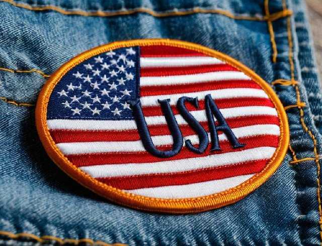
• Fabric Stability: The stability of the fabric is a primary consideration when selecting a base for embroidered lettering. Stable fabrics, such as cotton, twill, or denim, provide a firm foundation that resists distortion during stitching, making them ideal for most lettering projects. These fabrics hold up well under the tension of embroidery and maintain the clarity of the lettering.
• Working with Delicate Fabrics: For more delicate fabrics, such as silk, chiffon, or lace, additional care is required. These materials are prone to distortion and damage under the pressure of dense stitching. Using a stabilizer, a temporary or permanent backing material, can help support delicate fabrics during embroidery, preventing puckering and ensuring a smooth finish. Water soluble stabilizers are particularly useful for sheer fabrics, as they can be easily removed after stitching without leaving any residue.
• Textural Effects: The texture of the fabric itself can enhance or detract from the embroidered lettering. For example, a fabric with a raised texture, such as corduroy or velvet, may add depth and dimension to the text, creating a more dynamic visual effect. However, these fabrics can also pose challenges, as the texture may interfere with the clarity of the letters. In such cases, choosing a bolder font or adjusting the stitch density can help maintain legibility.
Enhancing Visual Appeal
Color plays a pivotal role in embroidered lettering, influencing both the readability and the overall aesthetic of the design. The choice of thread color, in relation to the fabric, can either make the text stand out or blend subtly into the background.
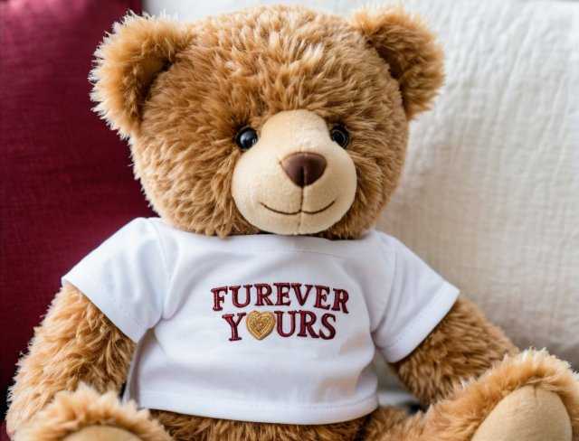
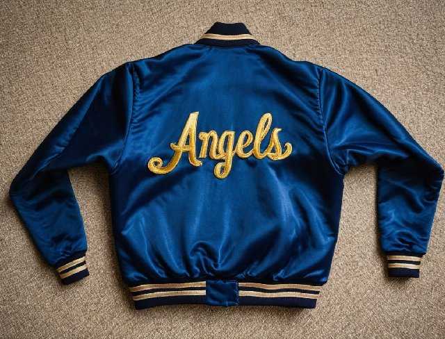
• High Contrast for Legibility: To ensure that the lettering is easily readable, it’s important to choose a thread color that contrasts sharply with the fabric. High contrast combinations, such as black thread on a white fabric or white thread on a dark fabric, are often the most effective for clear, legible text.
• Tone on Tone Effects: For a more subtle and sophisticated look, tone on tone embroidery, using a thread color that is only slightly different from the fabric, can be used. This approach is often employed in monograms or decorative lettering where a more understated effect is desired. While tone on tone designs can be elegant, care must be taken to ensure that the letters are still distinguishable from the fabric.
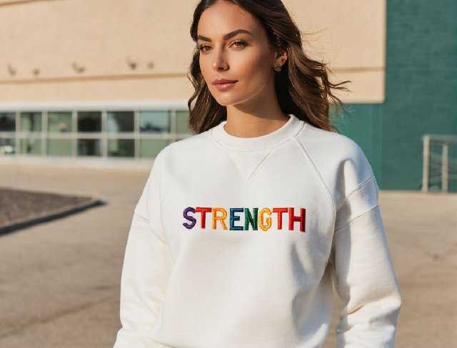
• Multicolored Designs: For more creative and dynamic lettering, using multiple thread colors can add visual interest and complexity. Gradient effects, where the thread color gradually changes across the lettering, can create a sense of movement and depth. Alternatively, using different colors for each letter can create a playful, eye catching design, ideal for more casual or whimsical projects.
By understanding and mastering these foundational elements, embroiderers can elevate their lettering projects, transforming simple text into compelling, artistic statements. Each decision, whether it’s the choice of font, stitch type, density, or fabric, contributes to the final piece, making embroidered typography a true fusion of art and craft.

2. Techniques for Perfecting Lettering
Achieving perfection in embroidered lettering requires a combination of technical skill, careful planning, and a deep understanding of the factors that influence the outcome. This section explores advanced techniques that can elevate your lettering from good to exceptional, providing a comprehensive guide to mastering the art of embroidered typography.
The Blueprint of Successful Embroidery
The digitization process is the foundation of any embroidery project, and its importance is even more pronounced in lettering. Digitizing is the process of converting a design or text into a format that an embroidery machine can read and execute. When it comes to lettering, precision in digitizing is crucial to ensure that the text is clear, legible, and aesthetically pleasing.
• Optimizing Stitch Pathing: The pathing, or the sequence in which the machine stitches the letters, can significantly impact the final appearance of the text. For instance, starting and stopping points should be carefully chosen to minimize jumps and trims, which can create loose threads or gaps in the design. Proper pathing ensures a smooth, continuous flow of stitches, enhancing the clarity and sharpness of the lettering.
• Adjusting Stitch Angles: The angle at which stitches are laid down can influence the texture and visual appeal of the lettering. For example, slight variations in the stitch angle can create subtle shadows and highlights, adding depth and dimension to the text. Experimenting with different angles for different parts of the letter can lead to more dynamic and visually interesting results.
• Compensation for Fabric Distortion: During the digitization process, it’s important to account for the potential distortion that can occur when the fabric is pulled tight in the embroidery hoop. This distortion, known as “push pull compensation,” can cause letters to appear stretched or compressed. By adjusting the width and spacing of the stitches in the digitizing software, embroiderers can preemptively correct for these distortions, ensuring that the final lettering maintains its intended proportions.
The Key to Crisp, Clear Lettering
Stabilization is a critical aspect of embroidery that directly affects the quality of the lettering. Without proper stabilization, the fabric can shift or pucker during stitching, leading to uneven, distorted letters. The choice of stabilizer, its placement, and how it is applied can all influence the outcome.
• Choosing the Right Stabilizer: The type of stabilizer used depends on the fabric and the complexity of the lettering. For stable fabrics like cotton or polyester, a medium weight cutaway stabilizer is often sufficient. This type of stabilizer remains in place after the embroidery is complete, providing long term support for the lettering. For delicate or sheer fabrics, a lightweight tear away or water soluble stabilizer may be more appropriate, as it can be easily removed after stitching without damaging the fabric.
• Double Layer Stabilization: For especially complex or dense lettering, using two layers of stabilizer can provide additional support. The first layer can be a cutaway stabilizer to ensure long term stability, while the second layer, typically a tear away or water soluble stabilizer, adds extra support during stitching but can be removed afterward. This technique is particularly useful when embroidering on stretchy or slippery fabrics, where additional stability is needed to prevent shifting.
• Floating Stabilizers: In cases where the fabric is too delicate or thick to be hooped without risking damage, a “floating” stabilizer technique can be employed. This involves hooping the stabilizer alone and then temporarily attaching the fabric on top using spray adhesive or pins. This method allows for better control over the fabric’s positioning and reduces the risk of hoop marks or distortion.
Thread Management
Thread quality and management are often overlooked aspects of embroidery, but they play a crucial role in the appearance and durability of the lettering. Proper thread selection, tension adjustment, and handling are key to producing crisp, clean letters.
• Selecting the Right Thread: The choice of thread affects not only the color and sheen of the lettering but also its durability and resistance to wear. Polyester threads are popular for their strength, colorfastness, and resistance to shrinkage, making them ideal for lettering that will be subjected to frequent washing or heavy use. Rayon threads, while softer and more lustrous, are more delicate and better suited for decorative lettering that won’t be exposed to harsh conditions.
• Managing Thread Tension: Proper thread tension is critical for achieving smooth, even stitches. If the tension is too tight, the thread can snap, causing skipped stitches or uneven coverage. If it’s too loose, the stitches can appear loose and messy, leading to gaps in the lettering. Regularly checking and adjusting the thread tension on your machine is essential, particularly when switching between different thread types or when using specialty threads like metallic or variegated threads.
• Thread Trimming Techniques: Clean and precise thread trimming is important for professional looking embroidery. Automatic thread trimmers on modern machines can help reduce the number of loose threads, but manual trimming is often necessary for intricate lettering designs. Using sharp embroidery scissors and taking care to trim threads as close to the fabric as possible without cutting into the stitches ensures a clean finish.
Hooping Techniques
Proper hooping is essential for maintaining fabric tension and ensuring that the lettering stitches out accurately. Poor hooping can lead to puckering, misalignment, and uneven stitches, all of which can compromise the quality of the embroidered lettering.
• Hoop Selection: The choice of hoop size and type can impact the stability of the fabric during stitching. A hoop that is too large may not hold the fabric taut enough, while a hoop that is too small may not provide adequate space for the lettering. It’s important to select a hoop that matches the size of the lettering design, allowing for even tension across the entire area.
• Hooping Techniques for Delicate Fabrics: For delicate or stretchy fabrics, using a no slip or soft sided hoop can help prevent the fabric from being damaged or distorted during stitching. These hoops have a special grip that holds the fabric securely without leaving marks or stretching the material. Additionally, placing a piece of fabric or stabilizer over the hoop’s outer ring before securing the fabric can help protect delicate materials.
• Aligning the Fabric: Proper alignment of the fabric within the hoop is critical for ensuring that the lettering stitches out in the correct position. Using alignment tools, such as grid rulers or laser guides, can help ensure that the fabric is perfectly straight and centered within the hoop. Marking the fabric with water soluble pens or chalk can also assist in aligning the design accurately.
Advanced Editing Techniques
Once the lettering design has been digitized and tested, advanced editing techniques can be used to refine and perfect the final result. These techniques allow embroiderers to make subtle adjustments that can have a significant impact on the overall quality and appearance of the lettering.
• Kerning Adjustments: Kerning, the space between letters, is an important factor in achieving balanced and visually appealing lettering. In embroidery, kerning adjustments may be needed to ensure that the letters are evenly spaced and that there are no gaps or overlaps. This is particularly important for cursive or script fonts, where the letters are often connected and need to flow smoothly from one to the next.
• Scaling and Resizing: Scaling and resizing the lettering design can present challenges, as increasing or decreasing the size of the letters can affect stitch density and coverage. When resizing a design, it’s important to adjust the stitch count accordingly to maintain the integrity of the lettering. Most digitizing software offers tools for automatic stitch recalculation, but manual adjustments may be needed to achieve the desired result.
• Test Stitching: Before committing to the final stitch out, it’s always advisable to perform a test stitch on a similar fabric to identify any issues with the design. Test stitching allows you to see how the lettering will appear on the actual material, giving you the opportunity to make adjustments to stitch density, tension, or pathing if needed. This step is particularly important for complex or intricate lettering designs, where even small adjustments can make a big difference.
Troubleshooting Common Issues
Even with careful planning and execution, issues can arise during the embroidery process. Being able to quickly identify and troubleshoot common problems is essential for achieving perfect lettering.
• Puckering: Puckering is a common issue where the fabric gathers or wrinkles around the stitches. This can be caused by improper hooping, excessive stitch density, or using the wrong type of stabilizer. To prevent puckering, ensure that the fabric is hooped tightly, adjust the stitch density to match the fabric, and choose a stabilizer that provides adequate support.
• Misaligned Letters: Misalignment can occur when the fabric shifts during stitching or if the design is not properly aligned in the hoop. To fix this issue, double check the alignment before starting, use a high quality stabilizer to prevent fabric movement, and consider using a basting stitch to hold the fabric in place.
• Thread Breaks: Frequent thread breaks can be frustrating and can interrupt the flow of the design. Common causes include incorrect thread tension, using an inappropriate needle, or poor quality thread. Regular machine maintenance, such as cleaning the bobbin case and checking the needle, can also help reduce thread breaks.
By mastering these techniques and addressing common challenges, embroiderers can achieve a level of precision and artistry in their lettering that truly sets their work apart. Perfecting embroidered typography is not just about following a set of rules; it’s about understanding the nuances of the craft and applying that knowledge to create text that is not only legible but also visually compelling and beautifully executed.
3. Overcoming Common Challenges in Lettering
Embroidered lettering, while immensely rewarding, presents a unique set of challenges that can test even experienced embroiderers. These challenges often stem from the delicate balance required between thread, fabric, digitization, and machine settings. Addressing these issues effectively demands a deep understanding of the root causes and the implementation of precise solutions. This section delves into some of the most common challenges in lettering embroidery and provides comprehensive strategies for overcoming them.
Fabric Distortion and Puckering
One of the most frequent challenges in embroidered lettering is fabric distortion, particularly puckering, which occurs when the fabric wrinkles or gathers around the stitched letters. This issue can severely compromise the legibility and overall aesthetic of the lettering, making it a primary concern for any embroidery project.
• Understanding Fabric Characteristics: Different fabrics react differently to the tension created by embroidery stitches. For example, lightweight or stretchy fabrics like jersey knit or silk are more prone to puckering due to their flexibility. On the other hand, heavier fabrics like denim or canvas are less susceptible to distortion but can still encounter issues if not properly stabilized. Understanding the properties of the fabric you’re working with is the first step in preventing puckering. Fabrics with a loose weave or those that are highly elastic require additional stabilization and possibly a lower stitch density to prevent distortion.
• Effective Stabilization Strategies: The role of stabilizers in preventing puckering cannot be overstated. A suitable stabilizer supports the fabric and maintains its tension during stitching, thereby reducing the risk of distortion. For problematic fabrics, consider using a heavier cutaway stabilizer, which provides long lasting support and remains in place after the embroidery is complete. In cases where a cutaway stabilizer is too bulky, a combination of a medium weight tear away stabilizer with a layer of water soluble topping can help maintain fabric integrity without adding excessive bulk. Additionally, applying a temporary spray adhesive to bond the fabric to the stabilizer can further reduce movement during stitching.
• Stitch Density Adjustments: Overly dense stitches can cause fabric distortion, especially in delicate fabrics. If you notice puckering in your test stitches, one of the first adjustments to make is to reduce the stitch density. This can be done by increasing the space between stitches, thereby reducing the overall tension exerted on the fabric. Digitizing software often allows you to fine tune stitch density, and it’s worth experimenting with these settings to find the optimal balance for your specific fabric and design. Remember, less dense stitches not only prevent puckering but also create a more flexible and comfortable finished product.
Achieving Consistent Quality
Thread tension and breakage are common challenges that can lead to inconsistent lettering quality, with issues ranging from uneven stitching to frequent interruptions in the embroidery process.
• Balancing Thread Tension: Proper thread tension is crucial for achieving even, smooth stitches. If the tension is too tight, it can cause the thread to break or the fabric to pucker. Conversely, if the tension is too loose, the stitches may appear loose and uneven, with gaps in the lettering. Balancing thread tension involves adjusting the settings on your machine based on the type of thread and fabric you’re using. It’s important to remember that different threads have different tension requirements; for instance, metallic threads often require looser tension compared to standard polyester or rayon threads. Regularly testing and adjusting the tension, especially when changing threads or fabrics, is key to maintaining consistent stitch quality.
• Choosing the Right Needle: Thread breakage is often a symptom of using the wrong type or size of needle for the thread and fabric. A needle that is too small can cause friction, leading to breaks, while a needle that is too large can leave noticeable holes in the fabric. For most embroidery threads, a size 75/11 or 80/12 embroidery needle works well, but metallic threads may require a larger eye needle, such as a size 90/14, to reduce friction and prevent shredding. Additionally, specialty needles designed for particular threads or fabrics, like ballpoint needles for knits or titanium coated needles for tough materials, can also reduce the risk of thread breaks.
• Regular Machine Maintenance: Regular maintenance of your embroidery machine is essential for preventing thread tension and breakage issues. Lint and debris can accumulate in the bobbin case and tension disks, leading to inconsistent tension and frequent thread breaks. Cleaning the machine regularly, especially after working with lint prone threads like cotton, can help maintain optimal performance. Additionally, replacing the needle after every 8 to 10 hours of stitching can prevent issues related to dull or damaged needles, which are common causes of thread breaks.

Letter Misalignment and Registration Issues
Letter misalignment and registration issues, where the stitches do not line up as intended, can be particularly frustrating when working on detailed lettering. These problems often result in crooked or overlapping letters, detracting from the overall quality of the embroidery.
• Hooping Accuracy: Proper hooping is fundamental to maintaining alignment throughout the embroidery process. If the fabric is not hooped evenly or is too loose, it can shift during stitching, causing misalignment. To ensure accurate hooping, use a grid or alignment marks on the fabric to position it correctly in the hoop. Tightening the fabric just enough to eliminate wrinkles without stretching it is crucial. Overstretching can lead to distortion once the fabric is released from the hoop, causing the letters to appear uneven.
• Floating Technique for Delicate Fabrics: For delicate or thick fabrics that are difficult to hoop, consider using the floating technique. This involves hooping only the stabilizer and then securing the fabric on top with a temporary adhesive or pins. This method reduces the risk of fabric distortion and makes it easier to achieve precise alignment, especially for fabrics that tend to shift in the hoop.
• Adjusting Stitch Sequence: Sometimes, misalignment occurs because of the order in which the letters are stitched. The machine’s movement can cause the fabric to shift slightly between letters, leading to registration issues. To counter this, adjust the stitch sequence in the digitizing software to minimize jumps and ensure that the letters stitch out in a continuous, logical order. This reduces the movement of the fabric and helps maintain consistent alignment.
Building a Strong Foundation
Underlay stitches are a critical but often overlooked component of embroidery, serving as the foundation upon which the top stitches are built. Poorly executed underlay can lead to issues such as insufficient coverage, uneven stitches, and distorted lettering.
• Selecting the Right Underlayment Type: Different types of underlay stitches serve different purposes, and selecting the appropriate type for your lettering is crucial. For instance, a center walk stitch underlay is ideal for small letters, as it provides a minimal foundation without adding bulk. For larger or more complex lettering, a combination of edge run and zigzag underlay offers both stabilization and padding, ensuring that the top stitches sit smoothly on the fabric. Experimenting with different underlay types can help you find the best combination for your specific project.
• Adjusting Underlay Density: The density of the underlay stitches plays a significant role in the final appearance of the lettering. Too dense an underlay can add unnecessary bulk, leading to a stiff and uncomfortable finished product. On the other hand, too sparse an underlay may fail to adequately support the top stitches, resulting in uneven coverage. Fine tuning the underlay density based on the fabric type, stitch density, and letter size can help achieve the desired balance between stability and softness.
• Controlling Underlay Placement: The placement of underlay stitches within the letters is another critical factor. Ideally, the underlay should extend slightly beyond the edges of the top stitches, providing a solid foundation without being visible. If the underlay is too close to the edge, it may peek out from under the top stitches, especially if the fabric shifts during stitching. Adjusting the placement of the underlay in the digitizing software allows for better control over its visibility and effectiveness.
Maintaining Vibrant and Crisp Designs
Color bleeding occurs when the dye from one thread color seeps into the surrounding fabric or other thread colors, creating a muddy or blurred appearance. This issue is particularly problematic in intricate lettering, where sharp color contrasts are essential for legibility and visual impact.
• Using Colorfast Threads: The first line of defense against color bleeding is to use high quality, colorfast threads. These threads are designed to resist bleeding, even when exposed to water or heat. Polyester threads are generally more colorfast than rayon threads, making them a better choice for projects that will be washed frequently or exposed to moisture.
• Prewashing Fabrics: Prewashing the fabric before embroidery can help remove any excess dye that might cause bleeding. This is especially important for dark or vibrant fabrics that are more likely to bleed. After prewashing, it’s a good idea to test the fabric with your chosen thread colors to ensure there are no unexpected reactions.
• Managing Thread Tension: Proper thread tension also plays a role in preventing color bleeding. If the tension is too tight, the thread can cut into the fabric, making it more likely that the dye will transfer. Conversely, if the tension is too loose, the thread may not fully penetrate the fabric, leading to uneven coverage and potential bleeding. Adjusting the thread tension to the optimal level for your fabric and thread combination can help maintain sharp, clean edges between colors.
Addressing Needle and Thread Compatibility
The interaction between the needle and thread is a critical aspect of achieving high quality embroidery. Incompatible needle and thread combinations can lead to issues such as fraying, breakage, and uneven stitches.
• Choosing the Right Needle Size: The needle size should match the thickness and type of thread being used. A needle that is too small for the thread can cause fraying or breakage, while a needle that is too large can leave noticeable holes in the fabric. For standard embroidery threads, a size 75/11 needle is typically sufficient. However, for thicker threads or specialty threads like metallics, a larger needle size, such as 90/14, may be necessary.
• Opting for Specialty Needles: Specialty threads, such as metallic or variegated threads, often require specific needle types to perform optimally. For example, metallic needles have a larger eye and a polished surface to reduce friction and prevent shredding. Using the correct needle for your thread type can greatly improve the overall quality of the embroidery and reduce the occurrence of thread breaks and other issues.
• Regular Needle Replacement: Regularly replacing the needle is essential for maintaining stitch quality and preventing issues related to needle wear. A dull or damaged needle can cause a range of problems, including skipped stitches, fraying, and thread breakage. As a rule of thumb, the needle should be replaced after every 8 to 10 hours of embroidery or sooner if you notice any signs of wear.
By addressing these common challenges with in depth knowledge and precise techniques, embroiderers can significantly enhance the quality of their lettering. Each solution not only resolves specific issues but also contributes to a more refined, professional finish in every project.
4. Creative Approaches to Embroidered Lettering
Embroidered lettering offers a vast canvas for creative expression, allowing embroiderers to transform simple text into a work of art. Beyond the technical aspects of stitching, the design process itself opens up numerous possibilities for innovation and personalization. Exploring creative approaches to embroidered lettering can elevate the final product, making it not just a functional piece but also a visually captivating and meaningful creation. This section delves into various creative strategies and techniques that can be employed to push the boundaries of traditional embroidered lettering.
Experimenting with Fonts and Typography
The choice of font is fundamental to the aesthetic of embroidered lettering. While standard embroidery fonts like block or script are reliable and widely used, experimenting with more unique or custom fonts can bring a fresh and distinctive look to your designs.
• Custom and Hand Drawn Fonts: One way to make embroidered lettering stand out is by creating or using custom fonts that reflect the style and personality of the project. Hand drawn fonts, which can be digitized for embroidery, offer a personal and artistic touch that standard fonts may lack. These fonts can be whimsical, elegant, or avant garde, depending on the desired effect. Custom fonts allow for more creativity in letter shapes, spacing, and alignment, enabling you to create lettering that is truly one of a kind.
• Mixing Font Styles: Combining different font styles within the same design can add visual interest and hierarchy to embroidered lettering. For instance, using a bold, block font for the main text and a delicate script for secondary elements can create a dynamic contrast that draws attention to specific parts of the design. This technique is particularly effective in logos, monograms, or any design where different levels of emphasis are needed. Careful consideration of how the fonts interact with each other and the overall composition is key to achieving a harmonious and visually appealing result.
• Exploring Typography Effects: Beyond the choice of font, the application of typography effects can further enhance the visual impact of embroidered lettering. Techniques such as shadowing, outlining, or 3D effects can give the letters depth and dimension, making them pop off the fabric. For example, adding a subtle shadow stitch in a slightly darker shade than the main text color can create the illusion of raised lettering, adding a tactile quality to the design. Similarly, using a contrasting thread color for an outline stitch can make the letters stand out against the background, creating a bold and striking effect.
Incorporating Gradient Threads
Gradient threads, also known as variegated threads, are a powerful tool for adding depth and visual complexity to embroidered lettering. These threads change color along their length, creating a gradient effect that can make the letters appear more dynamic and three dimensional.
• Strategic Placement of Gradient Threads: The key to using gradient threads effectively in lettering is strategic placement. By carefully planning where the color transitions will occur, you can create stunning effects that enhance the overall design. For instance, using a gradient thread in a single letter or word within a larger text can draw attention to that specific element, making it a focal point of the design. Alternatively, applying gradient threads to the entire text can create a cohesive and harmonious look, with subtle color shifts adding interest without overwhelming the viewer.
• Enhancing Specific Design Elements: Gradient threads are particularly effective in designs where the lettering mimics natural elements like water, fire, or foliage. The gradual color transitions can simulate the flow of water, the warmth of a flame, or the natural variation in leaf color, adding realism and depth to the embroidery. For example, a gradient thread transitioning from blue to green can be used in lettering for a design related to nature or the environment, reinforcing the theme and adding a layer of meaning to the text.
• Layering with Solid Colors: Combining gradient threads with solid colored threads can also yield striking results. For example, using a gradient thread for the main body of the letters and a solid color for the outline or underlay can create a layered effect that adds depth and contrast. This technique allows the gradient thread to take center stage while the solid color provides structure and clarity, ensuring that the text remains legible and well defined.

Playing with Scale and Proportions
Scale and proportion are powerful design elements that can be used to create impactful and memorable embroidered lettering. By varying the size of the letters or words, you can influence the viewer’s perception and create a sense of hierarchy within the design.
• Oversized Lettering: Embroidering letters at an oversized scale can create a bold and eye catching effect, making the text the dominant feature of the design. This approach is particularly effective for monograms, initials, or single words where the emphasis is on making a strong visual statement. Oversized lettering can be used to cover a large area of the fabric, such as the back of a jacket or the front of a tote bag, creating a dramatic and attention grabbing piece.
• Playing with Proportions: Varying the proportions of the letters within a single word or phrase can add a playful and dynamic quality to the design. For instance, you can elongate certain letters, compress others, or vary the height and width to create a unique and stylized look. This technique is often used in artistic or decorative designs, where the lettering is as much about visual impact as it is about legibility. Careful consideration of how the proportions affect the overall balance and flow of the design is essential to achieving a cohesive result.
• Micro Lettering for Intricate Details: At the other end of the spectrum, micro lettering involves stitching very small text that can be used for adding fine details or subtle messages within a larger design. Micro lettering requires precise digitization and careful control of stitch density and underlay to ensure that the letters remain legible. This technique is ideal for adding hidden messages, signatures, or intricate details that enhance the overall richness of the design without overwhelming the main elements.
Blending Techniques and Creating Unique Textures
Combining traditional embroidery techniques with modern methods can result in unique textures and effects that elevate embroidered lettering to an art form. This blend of old and new approaches allows for a wider range of creative possibilities and can result in lettering that is both innovative and timeless.
• Exploring 3D Embroidery: 3D embroidery, achieved through the use of foam or heavy stitching, can give the lettering a raised, sculptural quality that stands out from the fabric. This technique is particularly effective for creating bold, impactful lettering that demands attention. 3D embroidery is often used in logos, monograms, or decorative text where the goal is to create a sense of depth and physical presence. The choice of thread color and type, as well as the stitch pattern, plays a crucial role in enhancing the 3D effect and ensuring that the letters retain their shape and definition.
• Combining Appliqué with Embroidered Lettering: Appliqué involves stitching fabric shapes onto the base fabric before adding embroidered details. This technique can be creatively combined with embroidered lettering to add texture, color, and contrast to the design. For example, using a contrasting fabric for the appliqué letters and then adding embroidered outlines or details can create a striking, layered effect. This approach allows for more complex and colorful designs, as the fabric used for the appliqué can introduce patterns or textures that are difficult to achieve with thread alone.
Color Theory and Thread Selection
Color plays a crucial role in the overall impact of embroidered lettering, influencing not only the aesthetic appeal but also the readability and emotional resonance of the text. Understanding and applying color theory in thread selection can elevate the design, creating a cohesive and visually harmonious result.
• Understanding Color Harmony: Color harmony involves selecting colors that work well together and create a pleasing visual experience. This can be achieved through various approaches, such as using complementary colors (opposite on the color wheel), analogous colors (next to each other on the color wheel), or monochromatic schemes (variations of a single color). For example, a complementary color scheme might involve using a rich, deep blue for the main lettering and a warm orange for the outline, creating a vibrant and energetic contrast. An analogous color scheme, on the other hand, might use different shades of blue and green for a more subtle, harmonious look. The choice of color harmony should reflect the intended mood and message of the design.
• Emphasizing Key Elements with Color: Strategic use of color can be employed to highlight specific parts of the lettering, drawing the viewer’s eye to key elements. For instance, using a bright or contrasting color for the first letter of each word can create a sense of rhythm and emphasis, guiding the viewer through the text. Alternatively, using a gradient or ombre effect within the letters can add depth and movement, making the text more dynamic. Careful consideration of color placement and the relationship between colors can enhance the overall readability and impact of the design.
• Playing with Saturation and Contrast: Saturation and contrast are powerful tools in creating visual interest and legibility in embroidered lettering. High saturation colors, which are vivid and intense, can be used to create bold, eye catching text, while low saturation colors, which are more muted, can convey a sense of subtlety and sophistication. Contrast between the text and the background fabric is essential for readability, especially in small or intricate lettering. For example, using a dark thread on a light fabric or vice versa ensures that the letters stand out clearly. Playing with different levels of saturation and contrast can help achieve the desired visual effect and ensure that the text is both legible and aesthetically pleasing.
Creative approaches to embroidered lettering open up a world of possibilities, allowing embroiderers to push the boundaries of traditional design and craft truly unique pieces. Whether through experimenting with fonts, incorporating gradient threads, playing with scale, blending techniques, or applying color theory, each strategy offers a way to elevate lettering from mere text to a work of art. By embracing creativity and innovation, embroidered lettering can become a powerful form of self expression and a testament to the artistry and skill of the embroiderer.
Conclusion
The art of embroidered typography showcases the remarkable versatility and beauty of thread as a creative medium. Whether you’re designing a minimalistic monogram or an intricate phrase, the success of your lettering hinges on mastering both the technical aspects of embroidery and the subtleties of typography. Focusing on font selection, stitch types, and overcoming technical challenges ensures that your text is not only visually striking but also seamlessly integrated into the fabric.
By blending these elements with creativity and precision, you can transform ordinary text into a compelling and personalized design. The skillful application of techniques such as gradient threads, innovative typography, and thoughtful color choices elevates embroidered lettering to an art form. With ongoing practice and exploration, embroidered typography can serve as a powerful means of expression, infusing each project with individuality and flair.
Now that you have read through this article, feel free to SHOP for products we have created. If you are looking for something special which isn’t in our store, feel free to contact us.